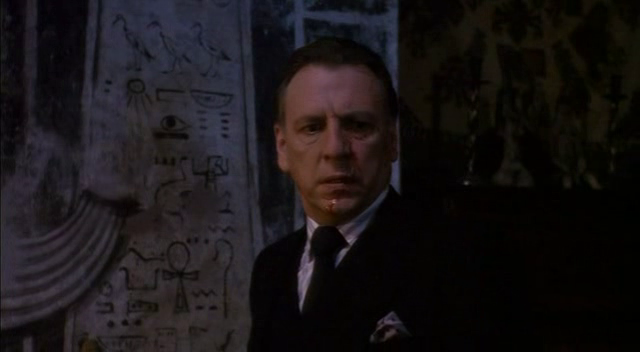
I was recently inspired to do a piece based on the historical account of Hellraiser. The movies date the earliest box to the late 1780’s. That being said, Dr Channard’s office (second movie) is full of artifacts that seem to have some reference to the box. When he brings the insane man into his office and puts him on the mattress, this is the image that is shown.
Because of this image I figured there had to be an ancient reference to the box, and I was going to make it.
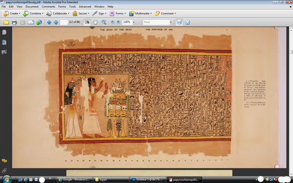
I knew that I wanted to make an account on papyrus using hieroglyphics, and that it should be fairly close to size and dimensions of writing of the time. There are some technical details that get fuzzy about the last sentence, but they will be cleared up later. I figured the best place to start is where anyone who’s heard of ancient Egypt has heard of – The Book Of The Dead, or more technically, The Papyrus Of Ani. This wonderful papyrus was taken from Egypt in the early 1900’s, and is today in the British Museum. Also in the early 1900’s E. A. Wallis budge made a facsimile copy of the papyrus and sold it in a book. Why is any of this important?
It’s all about sizing. How big were the glyphs? How wide were they? Without a starting point, it’s just a guess.
The measurements of the papyrus can be found almost anywhere, but I really needed straight on shots of the full papyrus. Thank you Internet Archive Digital Book Collection. They have a copy of the 1913 facsimile of the Papyrus Of Ani.

Now I have sizes and I can extrapolate the size of the glyphs. One problem, I still don’t have any idea on how to find glyphs that I can use. The glyph structure that is used today came from a man named Sir Alan Gardiner. All glyphs were arranged by type. All people were bunched together, birds, and so on. It is known as the Gardiner Sign List and can be found online.

Since I wanted to actually have a story, and not just random glyphs, I needed a dictionary. I found the Mark Vygus Middle Egyptian Dictionary and was on my way.

I wrote my short story and began to translate.
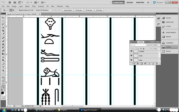

After the story was translated, I printed out the whole thing on transparency film and taped it to the back of the papyrus. From there I used a light box to ink all the glyphs.
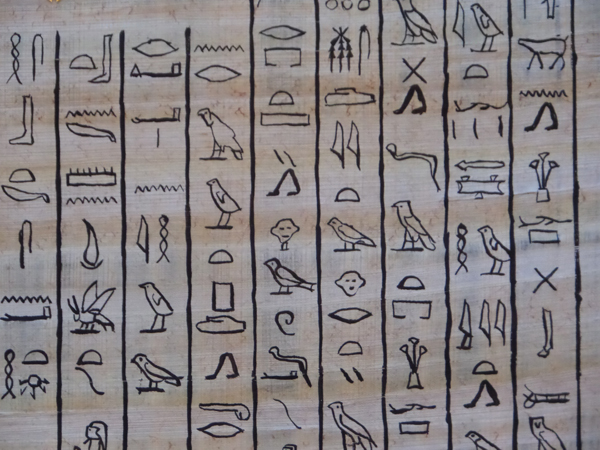
I wrote my story from the point of view of an ancient lowly priest who witnessed messengers from the gods give a box to a high priest. After solving the box, hearing screams, and returning to the room only to find blood and the box. The box was destroyed and a piece of metal was displayed as a warning to future generations about the dangers of the box. Of course there’s more to the story, but that’s the gist.
Before showing the finished product, there are a few things about the work that aren’t technically correct. Hieroglyphics were primarily used on walls, and in Books Of The Dead. Technically, Hieratic script would be used on papyrus. I did not use the correct sentence structure. Theirs and ours differ, but I had to make sense of what I was writing. Some of the words are not correct due to the Determinative. A series of symbols that represent a priest will end with a person that represents a priest so the reader knows for sure they are reading about a priest. Sometimes I used words without the correct determinative for ease of use and space issues.
There are also some fun things that are in the story, and in writing in general. Hieroglyphics can be read many ways, this one is written from top to bottom, from left to right. If you ever want to know which way to read the glyphs, look at the animals and people. They all face the beginning of the script. Some of the words have hidden meanings. The word I used for messenger can also mean demon. The E.A. Wallis Budge mentioned above is the same Budge that Daniel Jackson references in Stargate, “I don’t know why they keep reprinting his books”.
Enough yammering. I did spend a bit of time figuring all kinds of things out and I hope some of you enjoyed reading all my blathering. The papyrus sheet is 13 x 17 inches. Here’s the finished product.

There is a version 2.0 that is being inked currently that has cleaner borders and such.